
Creating A Successful Black Friday Campaign
Black Friday is not only the biggest shopping day of the year, but it also kicks off of the holiday shopping season. Creating a successful Black Friday campaign is an important part of advertising during the holidays for both retailers and marketers - a perfect opportunity to finish off the last quarter with a big sales boost.
CASE STUDY PERFORMED DURING MY TIME AS ART DIRECTOR AT MAXMEDIA CREATIVE AGENCY.
Black Friday and Cyber Monday are not only some of the biggest shopping days of the year, they also kick off of the holiday shopping season. Creating a Successful Black Friday Campaign is an important part of advertising during the holidays for both retailers and marketers. For Hogan’s Beach Shop, Black Friday 2017 was the perfect opportunity to finish off the last quarter with a big sales boost, gain some exposure for their Orlando location, and drive traffic to their new e-commerce site. We made use of various digital marketing techniques from email marketing to social media campaigns to make this campaign a success.

Starting Early
To make an effective Black Friday Campaign, starting early is vital. Using the power of Hulk Hogan’s voice and his fanbase, we began planning and laying the ground work in early October to grow our mailing list. The first wave of deals and savings would only be pushed through the e-newsletter, so we encouraged fans and followers to join the mailing list building excitement for these incentives. This grew our list, adding thousands of emails and allowing the hype to skyrocket.

Using the Timeline
A benefit of a Black Friday Campaign is the short timeline and high sales rates inherent in the holiday, which instills a sense of urgency and scarcity in the consumer. We began our sale at 6pm on Thanksgiving Day and ended at midnight on Cyber Monday. Because these deals had a strict time limit, consumers were pushed to make purchases readily. Furthermore, these products were in high demand, especially items like signed belts and memorabilia which were in limited supply and selling quickly.
Website Functionality
Streamlining the user experience was one of the first steps we took early on. We wanted to make sure the buying process was simple and the website could handle the influx of customers. We went through the buying process from beginning to final purchase to be sure the process was simple. We knew if it was difficult, customers would bounce out. Additionally, we added a countdown timer to keep the pressure on during the build up and browsing phases.
Social Media Presence
Additionally, we updated all of the Hogan’s Beach Shop social channels to prominently display the campaign message and used Hulk Hogan’s personal account to further push to sale. The HBS profile picture and cover photo were changed to match the campaign art. We added links in all descriptions to redirect users to the Black Friday landing page, and pinned a Black Friday post to the top of the profile so it was easily seen. We wanted all of the messaging to be front and center for the duration of the campaign.
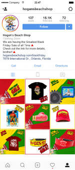
Instagram Feed Takeover
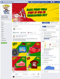
Facebook Feed Takeover
Creative
Naturally, social media channels contain a lot of static images or text, so video content tends to break up the feed and engage more viewers. For Hogan’s Beach Shop we utilized simple, animated, brand-aligned graphics and GIFs to capture the consumer’s attention. Multiple versions of these campaign graphics were used, featuring different products and the various sales. This allowed for A/B testing to determine which ads performed the best and fresh content that was not overexposed.

Black Friday Announcement Creative
Newsletter/Email Marketing
To supplement our social media advertising, we sent out regular email newsletters beginning in October. These e-mails were sent to previous, potential, and loyal customers. We took the time to design clean, simple, and well-structured newsletters. The CTA button was a vibrant and contrasting color, encouraging engagement. A bold headline drew in customers, and eye-catching images and captivating GIFs got them to click through to the website.
All in all, the success of our campaign was determined by the number of sales. Compared to Hogan’s Beach Shop’s 2016 November sales, their November 2017 revenue increased by nearly 300%. Our 2017 Black Friday Campaign was so successful because we started early, designed engaging creative, encouraged the right buying environment, and shared the messaging through multiple channels.
Casandra Hill assisted with the research and writing of this case study.

Principles of UX Design and Web Design
Developing an efficient website can be tricky. It is not enough to look beautiful, it must also function well. For our overhaul of the Mango’s Tropical Cafe website, we made sure to design a site that was effective on desktop and mobile, user-friendly, and efficient without sacrificing the thrill of being at Mango’s.
Mango’s Tropical Cafe
ROLE Art Director and Designer at Maxmedia Creative Agency
Developing an efficient website can be tricky. It is not enough to look beautiful, it must also function well. The previous Mango’s website focused on aesthetics over user experience. It took multiple clicks to get from the homepage to the antiquated reservation platform. For our overhaul, we made sure to design a site that was effective on desktop and mobile, user-friendly, and efficient without sacrificing the thrill of being at Mango’s.

Information Architecture
The first phase of designing a successful website is determining how the information is arranged. That means creating an organizational hierarchy that aligns with the user’s expectations. One of the most significant parts of this process is the navigation menu. By organizing the pages in a recognizable pattern, users are able to draw on their past web experiences to successfully navigate through the new Mango’s site.

Navigation Bar Organization
Navigation
Creating an intuitive path allows users to discover the Mango’s identity organically or get to where they are going quickly. Keeping the user at the forefront of our design, we stuck to a few key principles:
Reducing Clicks – Visitors to the Mango’s site need to get where they are going in the fewest clicks possible, leading to more reservations, faster.
Consistency – Each page of the new site is similarly organized with consistent design elements (navigation menu, footer, pre-footer, etc.) establishing habit-forming navigation.
Easy to find CTA – “Book Now” Call-to-Action buttons are located throughout the new website and take the user directly to a new, streamlined reservation system. Mango’s marks the success of their business by reservations, so it was important to make the reservation process to be quick, easy, and clear.
Internal Link and External Link Functionality – Internal links stay in the Mango’s website tab, while external links open in new tabs. Visited links change color to prevent users from revisiting the same pages, reducing frustration.
Closed Loop – Not letting visitors from getting stuck at the end of a page was a priority. A sticky navigation menu allows other pages to be visited without having to scroll to the top. Additionally, including a split pre-footer on every page directs visitors to other pages on the site like reservations.
Content Strategy
Information overload is a huge problem for many websites. Instead of packing everything into long paragraphs, we offer the visitor small chunks of information about various topics and a link to learn more if the visitor is interested. Short, sweet, and to the point.
When it came to copy, we intentionally used a voice that was relatable, clear, and easily understood by all types of users. By avoiding industry jargon, we reduced the risk of distancing users.


Visual Hierarchy
A majority of visitors scan over a webpage in a Z pattern from top to bottom, rather than read each block of text. Our solution was containing each topic to a block of color with no more than 2-3 sentences, so reading and scanning can be simultaneous. We included a corresponding image and a red CTA button in every block.
All clickable elements look clickable. This might seem silly to say; however, for user experience, a button needs to scream, “I am a button, Click me!” The CTA button is large enough to capture attention without being distracting. It is consistent across the whole website, becoming familiar to users.
Video/ Imagery
All the imagery used on the site is high-quality, visually engaging, and original content, allowing users to connect with the Mango’s brand before stepping inside.
When it comes to videos on the Mango’s site, these are our rules of thumb:
All videos were muted by default. Bounce rates increase when unwanted audio begins.
Videos less than a minute in length are more likely to be viewed in their entirety. When we could, we kept Mango’s videos short.
Always include captions! You can read more about the reasons behind this in our other article.
Search Bar
The search box is in the navigation bar on the far right of every page, where users expect to find it on mobile and desktop.
Forms
The forms on the Mango’s site only ask for what we really need and are organized logically, grouping related fields together, so they can be completed quickly and without confusion.
Loading Speed
The average user has about a 10 second attention span. That means if a website doesn’t load quick enough, the user will leave the site. To prevent this, we made sure the content is compressed and sized appropriately.
Mobile Layout
For the mobile layout, we stuck to a one-column design allowing for the best use of space and easy scaling between devices. The navigation menu was reduced to a hamburger icon; however, the “Book Now” button is still visible, because it is the main priority for the site. Any animations and hover-states were removed for mobile functionality and all the images crop responsively. Buttons are enlarged so they are easily targeted by the user (moving from clickable to touchable).
ADA Compliance, Color Impaired and/or Blind Users
Assistive technologies like screen readers are used by visually impaired visitors to interpret websites through alternative tags (alt-tags), which describe the appearance and function of an image. For Mango’s, we put a great deal of effort into writing accurate descriptions for each image, so users can envision what the image looks like and get a feel for Mango’s Tropical Cafe.
Additionally, color cannot be the only way to convey information. It should supplement or complement what is written and visible. For example, the contact forms on Mango’s site indicate through color and text when something has gone wrong.
Casandra Hill assisted with the research and writing of this case study.

How to Overcome Creative Blocks
The ultimate nightmare of creatives, creative blocks can get the best of us and can be a frustrating affair. Unfortunately in our industry, these blocks can come at the worst of times. In a world of looming deadlines and demanding clients, we must overcome these obstacles quickly or suffer the consequences.
How do I push through these mental blocks? I combat them with a few tricks up my sleeve.

PLOW THROUGH THE PROCESS
The best thing you can do is just get started. If you don’t start, then you can’t finish. By finishing an idea, you have completed a thought that will lead you to the next. And yes, the first idea might be terrible and look awful, but you completed the idea and that is the most important part. Now you can move on and figure out how to better represent that idea in a new way.
APPROACH FROM DIFFERENT ANGLES
If you are asked to create a square object but become frustrated by the confines, switch it up and go circular. But why go against the creative brief you ask? Because it will allow you to explore a new way of thinking about the same project. Stuck on landscape? Go portrait. View your idea from upside down. In doing so, the copy becomes abstract symbols and you are able to concentrate on the design.

BRAIN DUMP
Stuck on where to start? Take a sheet of paper and dump everything you know about the project-company names, buzzwords, colors, shapes, and so on. It will end up looking like a jumbled mess but you have now effectively visually represented your thoughts. Comb through these visual thoughts and pick out the good points.

GO FOR A WALK
Time is of the essence so long droughts don’t fly but on a project that is giving you trouble, go for a walk. By walking you are giving your brain a mental break and allowing your body to experience new sensations outside of your normal work environment. I always take this time to get a coffee, have a chat, and take a breather.

GET SOME FRESH EYES
SLEEP ON IT! If you can, this really is the best way to solve the issue. By sleeping on it, you are giving your brain a much needed break from the assignment. REM sleep has been known to help the creative process.

COLLABORATE
Not only fresh eyes for yourself are good, but getting someone else’s opinion can help this process. It might validate your initial thoughts or give you a new perspective. I especially like involving someone who has no background of the project and seeing what they see.


Engaging Your Audience Through Immersive Campaigns
Advertising has made a substantial switch from print media to digital consumption in the last 25 years, allowing for new forms of marketing to emerge. One good example of this is experiential marketing. This technique is used to promote overall brand awareness through experiences and real time engagement. By reaching out to the consumer before the purchase event, consumers are exposed to a brand in a more organic nature.
Advertising has made a substantial switch from print media to digital consumption in the last 25 years, allowing for new forms of marketing to emerge. One good example of this is experiential marketing. This technique is used to promote overall brand awareness through experiences and real time engagement. By reaching out to the consumer before the purchase event, consumers are exposed to a brand in a more organic nature.
When most campaigns are hosted online or within a private digital space, businesses and advertisers miss the opportunity to engage with their consumers on a basic interactive level. Through immersive marketing, advertisers are able to see the direct result of their hard work and creativity.
With the rise of OTT services, social media platforms, and overstimulation in our society, traditional ads go ignored. Experiential marketing helps break away from the norm and allows marketers to hit the streets—literally.
BLIZZARD STORE
Over 30 years ago, the Blizzard was born and with this came a promise; DQ’s signature confection must be served upside down to prove its delicious creaminess. In 2016 they re-enforced this policy with the creation of their “Upside Down or Free” campaign. Kicking it off, they created an inverted experience for any DQ lover, equipped with acrobats, ice cream, and a reassurance in their brand. Overall the campaign garnered almost 5 million interactions and created an experience like none other.
MINI SHORTCUT
To demonstrate a Mini’s ability to receive real time traffic updates, the British car company sponsored interactive billboards throughout Berlin. By building an immersive experience, German pedestrians were shown the value of shortened daily commutes. Mini was able to create an engaging campaign that had users thinking twice about how they moved through their city.
SNCF
With destinations all over Europe, the French national rail service wanted travelers to know that their routes extended past French borders. With this in mind, they created a user experience that educated consumers through interactive displays. Creating portals to new cities, users were able to see where they could choose to vacation next, via train.
MAILCHIMP
A company that understands its users and how to work the internet, Mailchimp created a campaign that took the world by storm. With a platform that can be used by all, Mailchimp wanted to approach potential users on a personal level. They designed engaging experiences like contests, short films, and snack foods. Through different presentations, they were able to reach multiple targeted audiences with the same message.
When most advertising has switched to digital consumption, it is nice to take a break and see the interaction between consumers and businesses. Inspired or know a really great interactive campaign? Comment below to let us know.

How to Advertise for the World Cup
Every year, more Americans become supporters of the beautiful game and the growth is evident. In the last 5 years, Major League Soccer (MLS) has seen 5 new expansion teams and 2 more are in the works for 2020. During the 2014 World Cup, over 26.5 million Americans tuned in for the final, an increase of 10% when compared to the 2010 World Cup final.
As an avid fan and follower, I have loved seeing the growth of American soccer in the last 10 years. This might be attributed to the influx of multicultural sports fans or maybe simply because it is the world’s game.
Every year, more Americans become supporters of the beautiful game and the growth is evident. In the last 5 years, Major League Soccer (MLS) has seen 5 new expansion teams and 2 more are in the works for 2020. During the 2014 World Cup, over 26.5 million Americans tuned in for the final, an increase of 10% when compared to the previous tournament.
““Heineken was not born here. Soccer was not born here. But the US consumer is embracing both.” ”
However with this new interest, comes a challenge for advertisers. Unlike its American counterparts, soccer does not lend itself easily to commercials. With more Americans becoming enthralled with the sport, advertisers are dealing with the challenges of the game. With no breaks during the 45 minute halves and less than 15 minutes during halftime, the scope of influence for traditional television ads are being reduced to nothing. So how have American advertisers gotten over these challenges?
TOURNAMENT SPONSORSHIP
The big daddy of them all, this level of advertising is reserved for a small group of brands that can afford the price tag to go along with it. Coca Cola, Visa, and McDonald’s are some to name a few. These partners of the upcoming World Cup enjoy full marketing rights, allowing them to capture the attention of international audiences.
STADIUM SIGN BOARDS
Think of them as mini billboards surrounding the pitch. These digital boards rotate brand collateral throughout the game, showing off their goods to the fans in the stadium, as well as all those watching on the live broadcast. At the club level, these tend to be more localized. On the international level (like the World Cup), brands like Adidas and Budweiser take over.

JERSEYS
Now think of these as moving billboards. Teams across the world sell ad placement on their jerseys as an additional point of revenue. The more popular the team, the more money you will have to dish out. In 2016, European teams generated $930 million from shirt sponsors alone. And with this form of advertising, it expands outside of the 11 men on the field. Fans around the world can buy replica jerseys that also have corporate names displayed on the front, substantially multiplying a brand’s reach. Taking inspiration from their European counterparts, the Portland Timbers struck up a cozy relationship with their sponsor Alaskan Airlines. Check out their unique partnership below:
IN GAME ADS
Due to soccer’s natural lack of stoppage, networks are getting more creative with their advertising by introducing in-stream ads. This form has become a point of contention between networks and viewers. Simple versions of this format include sponsored score boxes which remain static. Whereas, some networks have tested in stream ads that work as a ticker across the bottom of the screen. Networks such as FOX, will need to recoup their $400 million for the rights to broadcast the 2018 and 2020 World Cups and this is how they plan to do it.

SOCIAL MEDIA
All of these methods are great for big national brands, but the smaller business will not be able to afford such expensive means of advertising. This is when social media comes into play. With a strategic social media campaign you can hit fans with local ads for marginally less.


How to Create Great Logos
Over the years, I have been asked to make many brandmarks for clients. Some good. Some bad. But through every edit, I have picked up some tips and tricks on what makes a good logo.
I take on a lot of different roles, from graphic designer to videographer and photographer. But no matter the project before me, I am at the heart of every brand that I cultivate. So it is no surprise that my favorite thing to work on are logos because they create a narrative for a brand that is yet to be established.
Over the years, I have been asked to make many brandmarks for clients. Some good. Some bad. But through every edit, I have picked up some tips and tricks on what makes a good logo.
DON’T GIVE INTO TRENDS
As we move through design history, certain trends take over to create a temporary template for many designers to copy over and over again. Most of the time this happens when a client wants to stay “in trend”. If you’ve come to this point, STOP! You want to create a brand that is unique and in line with your client’s message. Sometimes you are unable to do this when you take on what’s popular. Skip the latest fashion trends and pull inspiration from brands that have stood the test of time.
TYPE IS KING
Quite simply, the best logos have been created through the showcasing of the brand’s name along. Look at FedEx, Absolut Vodka, and Visa. Which leads me to my next tip.
KEEP IT SIMPLE STUPID
Simplicity is key. By taking on this elementary way of thinking you create a brand that gets straight to the heart of it’s goal-establishing a brand that people recognize instantly. Allow the brand to develop on its own throughout the ages. The logo is meant to remind the user of who you are but let the rest of your collateral do the heavy lifting.
CONSIDER PRINTING COSTS
As designers, we love color and the ability to use it in everything we do. Consequently, we forget to make things “printer friendly” in an age where digital assets are taking over. When making a logo, you must consider where the logo will go in the future. Will it be embroidered on hats? Screenprinted on t-shirts? If you answered yes to any of these questions, you must create a logo that is easily identifiable when color is not present. Always make sure your logo can transform to a monotone version without losing its identity.
KEEP THE BALANCE
Sometimes with client input and rushed deadlines, this can easily be forgotten but within everything you do, symmetry is key. A slight shift to the right and the logo can look unbalanced and topsy turvy. By keeping in tune with the basic rules of composition, a logo can go from being harsh on the eyes to pleasant to look at.
COLOR WITH MEANING
Every color comes with meaning. Spanning over hundreds of years, the art of color and meaning plays a role in modern design. Take this into consideration when picking your perfect color palette.

Red: passion, heart, health Industry: Health Services, Advertising/Marketing
White: purity, neutral Industry: Publishing
Purple: royalty, creative Industry: Start-Ups, Education
Blue: dependable, strength, honest Industry: Transportation, Construction, Manufacturing
Green: nature, wisdom, wealth Industry: Agricultural, Banking
Yellow: happiness, warmth Industry: Food Services
Orange: friendly, cheerful Industry: Hospitality, Retail
CONSIDER YOUR AUDIENCE
And of course, don’t forget who is going to see this logo. Make the brand reflect the target audience, not the client. Yes, they want something that represents who they are as a brand, but most importantly, its needs to engage the audience that will buy their product.

7 Ways to Creatively Present Your Resume
Millennials and job seekers alike need to present their work experience in more creative ways. Here are a few examples of unique resumes that may help you land the job.
As the unemployment rate has significantly decreased in recent years, it has not boded well for Millennials. As reported by Generation Opportunity, young adults between the ages of 18-29 are experiencing an unemployment rate of 8 percent, as compared to the more moderate 3.7 percent for Americans over 29 years old. This results in a more competitive job market. With this in mind, Millennials and job seekers alike need to present their work experience in more creative ways. Here are a few examples of unique resumes that may help you land the job.
1. Print it on a shirt.

Always on the go and looking to go green? Then print your experience on a t-shirt. Your resume can be permanently on your back and on display for all to see.
Suggested for: Everyone
2. Make a video.
This is the best way to get your personality across to your potential employers. Make sure that it is precise and clear but shows your determination and creativity. It is easy to find examples for inspiration online, so be ready to show your smile and professionalism.
Suggested for: Filmmakers, Actors, and Customer Service Professionals
3. Make a Vine.
For the brave, you can even try to sell yourself in six seconds by making a Vine video. This is useful when buzzwords become an integral part of the application. Quick and precise, it takes the video resume to the next level.
Suggested for: Musicians, Radio Personalities, and Journalists
4. Create an online portfolio.
Skip carrying the heavy portfolio book and present everything digitally. This can be done through website hosts that allow you to display your best projects online. By doing so, you cannot only curate your own work but describe the creative process along the way.
Suggested for: Graphic Designers, Photographers, and Artists
5. Design an interactive resume.
Engaging your future employer is key and by creating a resume that is interactive you are able to show your skills through application. Such examples of this can include making a game out of your experience or mocking your favorite sales site to sale yourself.
Suggested for: Designers and Programmers
6. Create an infographic.
Infographics take text and numbers to create a visual display of data. By making an infographic resume, you are able to create a visual story of your past experiences. This is useful when you want to grab the attention of an HR manager who has just sifted through hundreds of applications. Using the images to engage the recipient, you are able to present the main points in an effective manner.
Suggested for: Statisticians and Researchers
7. Package it.
Send your future employers a small care package with your resume covering the box. Take this a step further and include something inside the packaging—like chocolates. This will connect your awesome cooking skills to your brand and will surely impress any sweet tooth.
Suggested for: Chefs, Advertising Professionals, and Product Designers