
Creating A Successful Black Friday Campaign
Black Friday is not only the biggest shopping day of the year, but it also kicks off of the holiday shopping season. Creating a successful Black Friday campaign is an important part of advertising during the holidays for both retailers and marketers - a perfect opportunity to finish off the last quarter with a big sales boost.
CASE STUDY PERFORMED DURING MY TIME AS ART DIRECTOR AT MAXMEDIA CREATIVE AGENCY.
Black Friday and Cyber Monday are not only some of the biggest shopping days of the year, they also kick off of the holiday shopping season. Creating a Successful Black Friday Campaign is an important part of advertising during the holidays for both retailers and marketers. For Hogan’s Beach Shop, Black Friday 2017 was the perfect opportunity to finish off the last quarter with a big sales boost, gain some exposure for their Orlando location, and drive traffic to their new e-commerce site. We made use of various digital marketing techniques from email marketing to social media campaigns to make this campaign a success.

Starting Early
To make an effective Black Friday Campaign, starting early is vital. Using the power of Hulk Hogan’s voice and his fanbase, we began planning and laying the ground work in early October to grow our mailing list. The first wave of deals and savings would only be pushed through the e-newsletter, so we encouraged fans and followers to join the mailing list building excitement for these incentives. This grew our list, adding thousands of emails and allowing the hype to skyrocket.

Using the Timeline
A benefit of a Black Friday Campaign is the short timeline and high sales rates inherent in the holiday, which instills a sense of urgency and scarcity in the consumer. We began our sale at 6pm on Thanksgiving Day and ended at midnight on Cyber Monday. Because these deals had a strict time limit, consumers were pushed to make purchases readily. Furthermore, these products were in high demand, especially items like signed belts and memorabilia which were in limited supply and selling quickly.
Website Functionality
Streamlining the user experience was one of the first steps we took early on. We wanted to make sure the buying process was simple and the website could handle the influx of customers. We went through the buying process from beginning to final purchase to be sure the process was simple. We knew if it was difficult, customers would bounce out. Additionally, we added a countdown timer to keep the pressure on during the build up and browsing phases.
Social Media Presence
Additionally, we updated all of the Hogan’s Beach Shop social channels to prominently display the campaign message and used Hulk Hogan’s personal account to further push to sale. The HBS profile picture and cover photo were changed to match the campaign art. We added links in all descriptions to redirect users to the Black Friday landing page, and pinned a Black Friday post to the top of the profile so it was easily seen. We wanted all of the messaging to be front and center for the duration of the campaign.
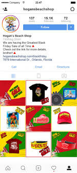
Instagram Feed Takeover
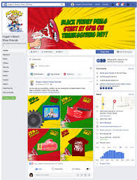
Facebook Feed Takeover
Creative
Naturally, social media channels contain a lot of static images or text, so video content tends to break up the feed and engage more viewers. For Hogan’s Beach Shop we utilized simple, animated, brand-aligned graphics and GIFs to capture the consumer’s attention. Multiple versions of these campaign graphics were used, featuring different products and the various sales. This allowed for A/B testing to determine which ads performed the best and fresh content that was not overexposed.

Black Friday Announcement Creative
Newsletter/Email Marketing
To supplement our social media advertising, we sent out regular email newsletters beginning in October. These e-mails were sent to previous, potential, and loyal customers. We took the time to design clean, simple, and well-structured newsletters. The CTA button was a vibrant and contrasting color, encouraging engagement. A bold headline drew in customers, and eye-catching images and captivating GIFs got them to click through to the website.
All in all, the success of our campaign was determined by the number of sales. Compared to Hogan’s Beach Shop’s 2016 November sales, their November 2017 revenue increased by nearly 300%. Our 2017 Black Friday Campaign was so successful because we started early, designed engaging creative, encouraged the right buying environment, and shared the messaging through multiple channels.
Casandra Hill assisted with the research and writing of this case study.

Principles of UX Design and Web Design
Developing an efficient website can be tricky. It is not enough to look beautiful, it must also function well. For our overhaul of the Mango’s Tropical Cafe website, we made sure to design a site that was effective on desktop and mobile, user-friendly, and efficient without sacrificing the thrill of being at Mango’s.
Mango’s Tropical Cafe
ROLE Art Director and Designer at Maxmedia Creative Agency
Developing an efficient website can be tricky. It is not enough to look beautiful, it must also function well. The previous Mango’s website focused on aesthetics over user experience. It took multiple clicks to get from the homepage to the antiquated reservation platform. For our overhaul, we made sure to design a site that was effective on desktop and mobile, user-friendly, and efficient without sacrificing the thrill of being at Mango’s.

Information Architecture
The first phase of designing a successful website is determining how the information is arranged. That means creating an organizational hierarchy that aligns with the user’s expectations. One of the most significant parts of this process is the navigation menu. By organizing the pages in a recognizable pattern, users are able to draw on their past web experiences to successfully navigate through the new Mango’s site.

Navigation Bar Organization
Navigation
Creating an intuitive path allows users to discover the Mango’s identity organically or get to where they are going quickly. Keeping the user at the forefront of our design, we stuck to a few key principles:
Reducing Clicks – Visitors to the Mango’s site need to get where they are going in the fewest clicks possible, leading to more reservations, faster.
Consistency – Each page of the new site is similarly organized with consistent design elements (navigation menu, footer, pre-footer, etc.) establishing habit-forming navigation.
Easy to find CTA – “Book Now” Call-to-Action buttons are located throughout the new website and take the user directly to a new, streamlined reservation system. Mango’s marks the success of their business by reservations, so it was important to make the reservation process to be quick, easy, and clear.
Internal Link and External Link Functionality – Internal links stay in the Mango’s website tab, while external links open in new tabs. Visited links change color to prevent users from revisiting the same pages, reducing frustration.
Closed Loop – Not letting visitors from getting stuck at the end of a page was a priority. A sticky navigation menu allows other pages to be visited without having to scroll to the top. Additionally, including a split pre-footer on every page directs visitors to other pages on the site like reservations.
Content Strategy
Information overload is a huge problem for many websites. Instead of packing everything into long paragraphs, we offer the visitor small chunks of information about various topics and a link to learn more if the visitor is interested. Short, sweet, and to the point.
When it came to copy, we intentionally used a voice that was relatable, clear, and easily understood by all types of users. By avoiding industry jargon, we reduced the risk of distancing users.


Visual Hierarchy
A majority of visitors scan over a webpage in a Z pattern from top to bottom, rather than read each block of text. Our solution was containing each topic to a block of color with no more than 2-3 sentences, so reading and scanning can be simultaneous. We included a corresponding image and a red CTA button in every block.
All clickable elements look clickable. This might seem silly to say; however, for user experience, a button needs to scream, “I am a button, Click me!” The CTA button is large enough to capture attention without being distracting. It is consistent across the whole website, becoming familiar to users.
Video/ Imagery
All the imagery used on the site is high-quality, visually engaging, and original content, allowing users to connect with the Mango’s brand before stepping inside.
When it comes to videos on the Mango’s site, these are our rules of thumb:
All videos were muted by default. Bounce rates increase when unwanted audio begins.
Videos less than a minute in length are more likely to be viewed in their entirety. When we could, we kept Mango’s videos short.
Always include captions! You can read more about the reasons behind this in our other article.
Search Bar
The search box is in the navigation bar on the far right of every page, where users expect to find it on mobile and desktop.
Forms
The forms on the Mango’s site only ask for what we really need and are organized logically, grouping related fields together, so they can be completed quickly and without confusion.
Loading Speed
The average user has about a 10 second attention span. That means if a website doesn’t load quick enough, the user will leave the site. To prevent this, we made sure the content is compressed and sized appropriately.
Mobile Layout
For the mobile layout, we stuck to a one-column design allowing for the best use of space and easy scaling between devices. The navigation menu was reduced to a hamburger icon; however, the “Book Now” button is still visible, because it is the main priority for the site. Any animations and hover-states were removed for mobile functionality and all the images crop responsively. Buttons are enlarged so they are easily targeted by the user (moving from clickable to touchable).
ADA Compliance, Color Impaired and/or Blind Users
Assistive technologies like screen readers are used by visually impaired visitors to interpret websites through alternative tags (alt-tags), which describe the appearance and function of an image. For Mango’s, we put a great deal of effort into writing accurate descriptions for each image, so users can envision what the image looks like and get a feel for Mango’s Tropical Cafe.
Additionally, color cannot be the only way to convey information. It should supplement or complement what is written and visible. For example, the contact forms on Mango’s site indicate through color and text when something has gone wrong.
Casandra Hill assisted with the research and writing of this case study.