
Creating A Successful Black Friday Campaign
Black Friday is not only the biggest shopping day of the year, but it also kicks off of the holiday shopping season. Creating a successful Black Friday campaign is an important part of advertising during the holidays for both retailers and marketers - a perfect opportunity to finish off the last quarter with a big sales boost.
CASE STUDY PERFORMED DURING MY TIME AS ART DIRECTOR AT MAXMEDIA CREATIVE AGENCY.
Black Friday and Cyber Monday are not only some of the biggest shopping days of the year, they also kick off of the holiday shopping season. Creating a Successful Black Friday Campaign is an important part of advertising during the holidays for both retailers and marketers. For Hogan’s Beach Shop, Black Friday 2017 was the perfect opportunity to finish off the last quarter with a big sales boost, gain some exposure for their Orlando location, and drive traffic to their new e-commerce site. We made use of various digital marketing techniques from email marketing to social media campaigns to make this campaign a success.

Starting Early
To make an effective Black Friday Campaign, starting early is vital. Using the power of Hulk Hogan’s voice and his fanbase, we began planning and laying the ground work in early October to grow our mailing list. The first wave of deals and savings would only be pushed through the e-newsletter, so we encouraged fans and followers to join the mailing list building excitement for these incentives. This grew our list, adding thousands of emails and allowing the hype to skyrocket.

Using the Timeline
A benefit of a Black Friday Campaign is the short timeline and high sales rates inherent in the holiday, which instills a sense of urgency and scarcity in the consumer. We began our sale at 6pm on Thanksgiving Day and ended at midnight on Cyber Monday. Because these deals had a strict time limit, consumers were pushed to make purchases readily. Furthermore, these products were in high demand, especially items like signed belts and memorabilia which were in limited supply and selling quickly.
Website Functionality
Streamlining the user experience was one of the first steps we took early on. We wanted to make sure the buying process was simple and the website could handle the influx of customers. We went through the buying process from beginning to final purchase to be sure the process was simple. We knew if it was difficult, customers would bounce out. Additionally, we added a countdown timer to keep the pressure on during the build up and browsing phases.
Social Media Presence
Additionally, we updated all of the Hogan’s Beach Shop social channels to prominently display the campaign message and used Hulk Hogan’s personal account to further push to sale. The HBS profile picture and cover photo were changed to match the campaign art. We added links in all descriptions to redirect users to the Black Friday landing page, and pinned a Black Friday post to the top of the profile so it was easily seen. We wanted all of the messaging to be front and center for the duration of the campaign.
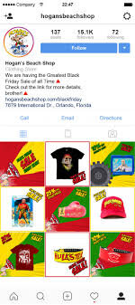
Instagram Feed Takeover
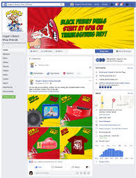
Facebook Feed Takeover
Creative
Naturally, social media channels contain a lot of static images or text, so video content tends to break up the feed and engage more viewers. For Hogan’s Beach Shop we utilized simple, animated, brand-aligned graphics and GIFs to capture the consumer’s attention. Multiple versions of these campaign graphics were used, featuring different products and the various sales. This allowed for A/B testing to determine which ads performed the best and fresh content that was not overexposed.

Black Friday Announcement Creative
Newsletter/Email Marketing
To supplement our social media advertising, we sent out regular email newsletters beginning in October. These e-mails were sent to previous, potential, and loyal customers. We took the time to design clean, simple, and well-structured newsletters. The CTA button was a vibrant and contrasting color, encouraging engagement. A bold headline drew in customers, and eye-catching images and captivating GIFs got them to click through to the website.
All in all, the success of our campaign was determined by the number of sales. Compared to Hogan’s Beach Shop’s 2016 November sales, their November 2017 revenue increased by nearly 300%. Our 2017 Black Friday Campaign was so successful because we started early, designed engaging creative, encouraged the right buying environment, and shared the messaging through multiple channels.
Casandra Hill assisted with the research and writing of this case study.

Principles of UX Design and Web Design
Developing an efficient website can be tricky. It is not enough to look beautiful, it must also function well. For our overhaul of the Mango’s Tropical Cafe website, we made sure to design a site that was effective on desktop and mobile, user-friendly, and efficient without sacrificing the thrill of being at Mango’s.
Mango’s Tropical Cafe
ROLE Art Director and Designer at Maxmedia Creative Agency
Developing an efficient website can be tricky. It is not enough to look beautiful, it must also function well. The previous Mango’s website focused on aesthetics over user experience. It took multiple clicks to get from the homepage to the antiquated reservation platform. For our overhaul, we made sure to design a site that was effective on desktop and mobile, user-friendly, and efficient without sacrificing the thrill of being at Mango’s.

Information Architecture
The first phase of designing a successful website is determining how the information is arranged. That means creating an organizational hierarchy that aligns with the user’s expectations. One of the most significant parts of this process is the navigation menu. By organizing the pages in a recognizable pattern, users are able to draw on their past web experiences to successfully navigate through the new Mango’s site.

Navigation Bar Organization
Navigation
Creating an intuitive path allows users to discover the Mango’s identity organically or get to where they are going quickly. Keeping the user at the forefront of our design, we stuck to a few key principles:
Reducing Clicks – Visitors to the Mango’s site need to get where they are going in the fewest clicks possible, leading to more reservations, faster.
Consistency – Each page of the new site is similarly organized with consistent design elements (navigation menu, footer, pre-footer, etc.) establishing habit-forming navigation.
Easy to find CTA – “Book Now” Call-to-Action buttons are located throughout the new website and take the user directly to a new, streamlined reservation system. Mango’s marks the success of their business by reservations, so it was important to make the reservation process to be quick, easy, and clear.
Internal Link and External Link Functionality – Internal links stay in the Mango’s website tab, while external links open in new tabs. Visited links change color to prevent users from revisiting the same pages, reducing frustration.
Closed Loop – Not letting visitors from getting stuck at the end of a page was a priority. A sticky navigation menu allows other pages to be visited without having to scroll to the top. Additionally, including a split pre-footer on every page directs visitors to other pages on the site like reservations.
Content Strategy
Information overload is a huge problem for many websites. Instead of packing everything into long paragraphs, we offer the visitor small chunks of information about various topics and a link to learn more if the visitor is interested. Short, sweet, and to the point.
When it came to copy, we intentionally used a voice that was relatable, clear, and easily understood by all types of users. By avoiding industry jargon, we reduced the risk of distancing users.


Visual Hierarchy
A majority of visitors scan over a webpage in a Z pattern from top to bottom, rather than read each block of text. Our solution was containing each topic to a block of color with no more than 2-3 sentences, so reading and scanning can be simultaneous. We included a corresponding image and a red CTA button in every block.
All clickable elements look clickable. This might seem silly to say; however, for user experience, a button needs to scream, “I am a button, Click me!” The CTA button is large enough to capture attention without being distracting. It is consistent across the whole website, becoming familiar to users.
Video/ Imagery
All the imagery used on the site is high-quality, visually engaging, and original content, allowing users to connect with the Mango’s brand before stepping inside.
When it comes to videos on the Mango’s site, these are our rules of thumb:
All videos were muted by default. Bounce rates increase when unwanted audio begins.
Videos less than a minute in length are more likely to be viewed in their entirety. When we could, we kept Mango’s videos short.
Always include captions! You can read more about the reasons behind this in our other article.
Search Bar
The search box is in the navigation bar on the far right of every page, where users expect to find it on mobile and desktop.
Forms
The forms on the Mango’s site only ask for what we really need and are organized logically, grouping related fields together, so they can be completed quickly and without confusion.
Loading Speed
The average user has about a 10 second attention span. That means if a website doesn’t load quick enough, the user will leave the site. To prevent this, we made sure the content is compressed and sized appropriately.
Mobile Layout
For the mobile layout, we stuck to a one-column design allowing for the best use of space and easy scaling between devices. The navigation menu was reduced to a hamburger icon; however, the “Book Now” button is still visible, because it is the main priority for the site. Any animations and hover-states were removed for mobile functionality and all the images crop responsively. Buttons are enlarged so they are easily targeted by the user (moving from clickable to touchable).
ADA Compliance, Color Impaired and/or Blind Users
Assistive technologies like screen readers are used by visually impaired visitors to interpret websites through alternative tags (alt-tags), which describe the appearance and function of an image. For Mango’s, we put a great deal of effort into writing accurate descriptions for each image, so users can envision what the image looks like and get a feel for Mango’s Tropical Cafe.
Additionally, color cannot be the only way to convey information. It should supplement or complement what is written and visible. For example, the contact forms on Mango’s site indicate through color and text when something has gone wrong.
Casandra Hill assisted with the research and writing of this case study.

Cricut Crafting Do's and Dont's
Last January, I got a Cricut Explore Air to help out with a lot of my wedding DIY and have grown an appreciation for crafting and working with my hands. At work I spend all day on the computer so the ability to create something that is more tangible is very satisfying.In just 10 months, I have worked a lot with my Cricut Maker and wanted to share some of the DOs and DONTs I have learned along the way.
After a long day at the office, everyone needs a way to decompress. However, instead of plopping down and binge watching my favorite show, I like to do something a little more hands on.
Last January, I got a Cricut Explore Air to help out with a lot of my wedding DIY and have grown an appreciation for crafting and working with my hands. At work I spend all day on the computer so the ability to create something that is more tangible is very satisfying.In just 10 months, I have worked a lot with my Cricut Maker and wanted to share some of the DOs and DONTs I have learned along the way.


DO GET CREATIVE.
Everyday I work closely with my clients to make sure their brand is well represented in the creative that we make. This means making sure that the right fonts are used, the colors match the established shades, and everything we create is brand-aligned. So it is nice to come home to my own projects where I have complete creative control. For my wedding, my typefaces and palette are unlike anything I have made for my clients and it is uniquely me.

DON’T BE AFRAID TO TRY NEW THINGS.
Have you been roaming Pinterest and found an amazing project you want to tackle but have no idea how? Go for it! What is the worst that can happen? I find these projects are worth your time and energy because you may learn some good lessons along the way.


DO LEARN THE BASICS OF THE ADOBE SUITE.
This is important. I may be a little biased with my graphic design background but getting to know how to effectively use Photoshop or Illustrator will go a long way. You will find that by investing in your skills, it will become easier and cheaper to tackle the bigger projects.


DON’T UNDER VALUE YOUR TIME.
After a few weeks of showing off your designs, people will come to you with their own projects. Take these on as they are good practice but don’t undervalue your talents. Crafting takes time and allow yourself enough time to take on these extra projects.

DO TEST YOUR MATERIALS.
Always use cheap paper, vinyl, and scraps to test cuts. Settings may have shifted or the mat might start to lose tackiness. Trust me, I’ve wasted too much good material by not doing small tests.


DON’T RUSH YOUR PROJECTS.
Working with the Cricut takes time and patience. If you have a set deadline, give yourself some time with the project. My biggest mistakes have happened when I’ve rushed a project. I would also suggest not drinking while Cricutting either. It makes for some uneven lines.


How to Overcome Creative Blocks
The ultimate nightmare of creatives, creative blocks can get the best of us and can be a frustrating affair. Unfortunately in our industry, these blocks can come at the worst of times. In a world of looming deadlines and demanding clients, we must overcome these obstacles quickly or suffer the consequences.
How do I push through these mental blocks? I combat them with a few tricks up my sleeve.

PLOW THROUGH THE PROCESS
The best thing you can do is just get started. If you don’t start, then you can’t finish. By finishing an idea, you have completed a thought that will lead you to the next. And yes, the first idea might be terrible and look awful, but you completed the idea and that is the most important part. Now you can move on and figure out how to better represent that idea in a new way.
APPROACH FROM DIFFERENT ANGLES
If you are asked to create a square object but become frustrated by the confines, switch it up and go circular. But why go against the creative brief you ask? Because it will allow you to explore a new way of thinking about the same project. Stuck on landscape? Go portrait. View your idea from upside down. In doing so, the copy becomes abstract symbols and you are able to concentrate on the design.

BRAIN DUMP
Stuck on where to start? Take a sheet of paper and dump everything you know about the project-company names, buzzwords, colors, shapes, and so on. It will end up looking like a jumbled mess but you have now effectively visually represented your thoughts. Comb through these visual thoughts and pick out the good points.

GO FOR A WALK
Time is of the essence so long droughts don’t fly but on a project that is giving you trouble, go for a walk. By walking you are giving your brain a mental break and allowing your body to experience new sensations outside of your normal work environment. I always take this time to get a coffee, have a chat, and take a breather.

GET SOME FRESH EYES
SLEEP ON IT! If you can, this really is the best way to solve the issue. By sleeping on it, you are giving your brain a much needed break from the assignment. REM sleep has been known to help the creative process.

COLLABORATE
Not only fresh eyes for yourself are good, but getting someone else’s opinion can help this process. It might validate your initial thoughts or give you a new perspective. I especially like involving someone who has no background of the project and seeing what they see.


Engaging Your Audience Through Immersive Campaigns
Advertising has made a substantial switch from print media to digital consumption in the last 25 years, allowing for new forms of marketing to emerge. One good example of this is experiential marketing. This technique is used to promote overall brand awareness through experiences and real time engagement. By reaching out to the consumer before the purchase event, consumers are exposed to a brand in a more organic nature.
Advertising has made a substantial switch from print media to digital consumption in the last 25 years, allowing for new forms of marketing to emerge. One good example of this is experiential marketing. This technique is used to promote overall brand awareness through experiences and real time engagement. By reaching out to the consumer before the purchase event, consumers are exposed to a brand in a more organic nature.
When most campaigns are hosted online or within a private digital space, businesses and advertisers miss the opportunity to engage with their consumers on a basic interactive level. Through immersive marketing, advertisers are able to see the direct result of their hard work and creativity.
With the rise of OTT services, social media platforms, and overstimulation in our society, traditional ads go ignored. Experiential marketing helps break away from the norm and allows marketers to hit the streets—literally.
BLIZZARD STORE
Over 30 years ago, the Blizzard was born and with this came a promise; DQ’s signature confection must be served upside down to prove its delicious creaminess. In 2016 they re-enforced this policy with the creation of their “Upside Down or Free” campaign. Kicking it off, they created an inverted experience for any DQ lover, equipped with acrobats, ice cream, and a reassurance in their brand. Overall the campaign garnered almost 5 million interactions and created an experience like none other.
MINI SHORTCUT
To demonstrate a Mini’s ability to receive real time traffic updates, the British car company sponsored interactive billboards throughout Berlin. By building an immersive experience, German pedestrians were shown the value of shortened daily commutes. Mini was able to create an engaging campaign that had users thinking twice about how they moved through their city.
SNCF
With destinations all over Europe, the French national rail service wanted travelers to know that their routes extended past French borders. With this in mind, they created a user experience that educated consumers through interactive displays. Creating portals to new cities, users were able to see where they could choose to vacation next, via train.
MAILCHIMP
A company that understands its users and how to work the internet, Mailchimp created a campaign that took the world by storm. With a platform that can be used by all, Mailchimp wanted to approach potential users on a personal level. They designed engaging experiences like contests, short films, and snack foods. Through different presentations, they were able to reach multiple targeted audiences with the same message.
When most advertising has switched to digital consumption, it is nice to take a break and see the interaction between consumers and businesses. Inspired or know a really great interactive campaign? Comment below to let us know.

How to Be Green on a Budget
A couple months ago, I was mindlessly scrolling through Facebook and stumbled onto an interesting video. In this video, a woman was challenged to live 30 days with zero waste. The point of the video? To demonstrate how hard it is for an individual to go an entire month without creating trash. So I started wondering how hard is it to be green on a budget?
A couple months ago, I was mindlessly scrolling through Facebook and stumbled onto an interesting video. In this video, a woman was challenged to live 30 days with zero waste. The point of the video? To demonstrate how hard it is for an individual to go an entire month without creating trash. So I started wondering how hard is it to be green on a budget?
Did you know that the average American creates 4.3 pounds of trash per day? That amounts to almost 1,600 pounds per year! So of course, this got me thinking of my daily waste production and let me tell you, it wasn’t pretty.
So I thought, what can I do to help reduce my carbon footprint? And how could I do so on a budget?
SWITCH OUT YOUR TOOTH BRUSH.
You know those plastic tooth brushes given to you by your trusty dentist? Yeah, those are terrible for the environment. Most common toothbrushes are made entirely from NON-biodegradable materials. This means that your tooth brush will be on this planet longer than you or your teeth.
So what can you do? I recently switched over to a biodegradable bamboo tooth brush and haven’t looked back.

Photo from The Charcoal Toothbrush
SHOP AT BULK STORES.
Containers and food packaging alone contributes to over 23% of the material reaching US landfills. By shopping at places like Bulk Nation you have the ability to buy dry goods without the wasteful packing, severely cutting down on your own personal trash. Some places even give you a discount when you supply your own containers. I got these handy ones that do the trick in my kitchen.

Photo from Bulk Nation
BUY FROM YOUR LOCAL FARMER.
You would be surprised the amount of waste you create when shopping at the big box stores. With multiple locations, these superstores ship their products far and wide creating the need to package their goods in protective containers.
By shopping locally, you cut unconsciously cut down on gas emissions and the need for protective packaging. A big shoutout to my favorite local farm, New Growth who is leading the way in urban farming in the City Beautiful with their eco-friendly, field to market grown greens.

Photo from New Growth Urban Farm
BAR SOAP IS THE WAY TO GO.
A simple switch is to try swapping your liquid soap for bar soap. The plastic bottles that most liquid soap is stored in is NON-biodegradable and only half of Americans recycle them. By using bar soap, you eliminate the amount of plastic in your home.

Photo from Oregon Soap Company
DITCH THE PAPER TOWELS.
Trashed paper towels add up to 3,000 tons of waste in the US every single day. Why misuse a resource that gives us clean air, regulates our climate, protects our soil, and produces oxygen for us to live?
So in my home, I have replaced paper towels with reusable micro fiber cloths. I find that they clean better and reduce my household waste substantially.

Photo from Amazon
STOP USING STRAWS!
So this is the one I am really struggling with. Drinking with a straw is a bad habit that I am desperately trying to quit. Many eco-bloggers suggest switching from plastic to metal straws. But let’s be honest, do you really need a straw? Whenever you go out, you are automatically given a straw for your water, your coffee, or your cocktail. So how do you prevent this from happening? Just do your best to be conscious and aware. No one is perfect and eventually you will remember to refuse straws.

Photo from 1 Million Women
START COMPOSTING.
More food reaches landfills than any other single component of municipal solid waste. So how do we cut down on what gets to the landfill? Composting! Making compost helps keep the landfills smaller and reduces the release of methane, a potent greenhouse gas. Additionally, it helps keep our house plants healthy and well fed.
Interested in getting started? The City of Orlando offers free home composters to all residents. Click here for more information on how you can get started!

Photo from City of Orlando
Overall, none of my ideas are innovative or genius but my hope for this blog post is to help people understand that going green can be relatively inexpensive. We all know the dangers our planet is facing and when we become more aware of our impact it helps us reduce our carbon footprint one step at a time.

How to Advertise for the World Cup
Every year, more Americans become supporters of the beautiful game and the growth is evident. In the last 5 years, Major League Soccer (MLS) has seen 5 new expansion teams and 2 more are in the works for 2020. During the 2014 World Cup, over 26.5 million Americans tuned in for the final, an increase of 10% when compared to the 2010 World Cup final.
As an avid fan and follower, I have loved seeing the growth of American soccer in the last 10 years. This might be attributed to the influx of multicultural sports fans or maybe simply because it is the world’s game.
Every year, more Americans become supporters of the beautiful game and the growth is evident. In the last 5 years, Major League Soccer (MLS) has seen 5 new expansion teams and 2 more are in the works for 2020. During the 2014 World Cup, over 26.5 million Americans tuned in for the final, an increase of 10% when compared to the previous tournament.
““Heineken was not born here. Soccer was not born here. But the US consumer is embracing both.” ”
However with this new interest, comes a challenge for advertisers. Unlike its American counterparts, soccer does not lend itself easily to commercials. With more Americans becoming enthralled with the sport, advertisers are dealing with the challenges of the game. With no breaks during the 45 minute halves and less than 15 minutes during halftime, the scope of influence for traditional television ads are being reduced to nothing. So how have American advertisers gotten over these challenges?
TOURNAMENT SPONSORSHIP
The big daddy of them all, this level of advertising is reserved for a small group of brands that can afford the price tag to go along with it. Coca Cola, Visa, and McDonald’s are some to name a few. These partners of the upcoming World Cup enjoy full marketing rights, allowing them to capture the attention of international audiences.
STADIUM SIGN BOARDS
Think of them as mini billboards surrounding the pitch. These digital boards rotate brand collateral throughout the game, showing off their goods to the fans in the stadium, as well as all those watching on the live broadcast. At the club level, these tend to be more localized. On the international level (like the World Cup), brands like Adidas and Budweiser take over.

JERSEYS
Now think of these as moving billboards. Teams across the world sell ad placement on their jerseys as an additional point of revenue. The more popular the team, the more money you will have to dish out. In 2016, European teams generated $930 million from shirt sponsors alone. And with this form of advertising, it expands outside of the 11 men on the field. Fans around the world can buy replica jerseys that also have corporate names displayed on the front, substantially multiplying a brand’s reach. Taking inspiration from their European counterparts, the Portland Timbers struck up a cozy relationship with their sponsor Alaskan Airlines. Check out their unique partnership below:
IN GAME ADS
Due to soccer’s natural lack of stoppage, networks are getting more creative with their advertising by introducing in-stream ads. This form has become a point of contention between networks and viewers. Simple versions of this format include sponsored score boxes which remain static. Whereas, some networks have tested in stream ads that work as a ticker across the bottom of the screen. Networks such as FOX, will need to recoup their $400 million for the rights to broadcast the 2018 and 2020 World Cups and this is how they plan to do it.

SOCIAL MEDIA
All of these methods are great for big national brands, but the smaller business will not be able to afford such expensive means of advertising. This is when social media comes into play. With a strategic social media campaign you can hit fans with local ads for marginally less.


How to Create Great Logos
Over the years, I have been asked to make many brandmarks for clients. Some good. Some bad. But through every edit, I have picked up some tips and tricks on what makes a good logo.
I take on a lot of different roles, from graphic designer to videographer and photographer. But no matter the project before me, I am at the heart of every brand that I cultivate. So it is no surprise that my favorite thing to work on are logos because they create a narrative for a brand that is yet to be established.
Over the years, I have been asked to make many brandmarks for clients. Some good. Some bad. But through every edit, I have picked up some tips and tricks on what makes a good logo.
DON’T GIVE INTO TRENDS
As we move through design history, certain trends take over to create a temporary template for many designers to copy over and over again. Most of the time this happens when a client wants to stay “in trend”. If you’ve come to this point, STOP! You want to create a brand that is unique and in line with your client’s message. Sometimes you are unable to do this when you take on what’s popular. Skip the latest fashion trends and pull inspiration from brands that have stood the test of time.
TYPE IS KING
Quite simply, the best logos have been created through the showcasing of the brand’s name along. Look at FedEx, Absolut Vodka, and Visa. Which leads me to my next tip.
KEEP IT SIMPLE STUPID
Simplicity is key. By taking on this elementary way of thinking you create a brand that gets straight to the heart of it’s goal-establishing a brand that people recognize instantly. Allow the brand to develop on its own throughout the ages. The logo is meant to remind the user of who you are but let the rest of your collateral do the heavy lifting.
CONSIDER PRINTING COSTS
As designers, we love color and the ability to use it in everything we do. Consequently, we forget to make things “printer friendly” in an age where digital assets are taking over. When making a logo, you must consider where the logo will go in the future. Will it be embroidered on hats? Screenprinted on t-shirts? If you answered yes to any of these questions, you must create a logo that is easily identifiable when color is not present. Always make sure your logo can transform to a monotone version without losing its identity.
KEEP THE BALANCE
Sometimes with client input and rushed deadlines, this can easily be forgotten but within everything you do, symmetry is key. A slight shift to the right and the logo can look unbalanced and topsy turvy. By keeping in tune with the basic rules of composition, a logo can go from being harsh on the eyes to pleasant to look at.
COLOR WITH MEANING
Every color comes with meaning. Spanning over hundreds of years, the art of color and meaning plays a role in modern design. Take this into consideration when picking your perfect color palette.

Red: passion, heart, health Industry: Health Services, Advertising/Marketing
White: purity, neutral Industry: Publishing
Purple: royalty, creative Industry: Start-Ups, Education
Blue: dependable, strength, honest Industry: Transportation, Construction, Manufacturing
Green: nature, wisdom, wealth Industry: Agricultural, Banking
Yellow: happiness, warmth Industry: Food Services
Orange: friendly, cheerful Industry: Hospitality, Retail
CONSIDER YOUR AUDIENCE
And of course, don’t forget who is going to see this logo. Make the brand reflect the target audience, not the client. Yes, they want something that represents who they are as a brand, but most importantly, its needs to engage the audience that will buy their product.

Wanda Raimundi-Ortiz
Despite traditional training in painting and drawing, Raimundi-Ortiz is best known for her performance and interactive art. As an award-winning interdisciplinary artist, she has created works through means of video, installation, spoken word, and performance art.
Wanda Raimundi-Ortiz was born in the Bronx and raised by a Puerto Rican mother and father. Naming herself a ‘Nuyorican’, she has struggled with her identity as a first-generation American born into a country founded on immigrants. She is a walking contradiction in her struggle to discover herself in a society with predetermined categories. Unsure what group to include herself in, she uses art as means to challenge these labels.
Despite traditional training in painting and drawing, Raimundi-Ortiz is best known for her performance and interactive art. As an award-winning interdisciplinary artist, she has created works through means of video, installation, spoken word, and performance art. She discovered that she needed to express her thoughts and beliefs through means that outstretched a simple canvas. Craving a larger outlet for her creative overflow, she turned to this technique as a better conduit for her artistic energy.

PorcelaReina (Queen Series), performance portrait by Melissa Bush
Can you describe your artistic process?
My work is really grounded in storytelling. There is a story that needs telling, and I work on finding a way that tells that story in a unique way. Can I move bodies around a room? Can I challenge the viewer with their own expectations/biases? Can I use a popular art method in an unexpected way? Much of my ‘studio time’ is spent watching people, thinking of how they move and behave. I pay attention to my experiences and try to find ways to make a very personal thing relatable to others… the challenge is in keeping the process exciting and fresh for myself. How do I make this a personal challenge? How do I keep my ideas and work creatively relevant for audiences? Where do I draw the line? Where do I cross it? I am also interested in art as activism, a platform to have uncomfortable discussions about otherness. The source of my work is my own experience being a misfit Other (as most of us are) and navigating that landscape of Puerto Rican, American, academic, artist, trouble maker, observer, Bronx chick transplant, code-switcher, culture conduit. Since most misfits are charged with the task of teaching about their otherness (whether we want to or not) I use the work as a multi-purpose tool.

Bargain Basement Sovereign” 2015, photo by Dominic Di Paolo
Did your interest in performance art come after your training as a painter and drawer? Or did both methods simultaneously grow? What got you into performance art?
I was primarily trained in drawing and illustration. Performance happened when I, Wanda Raimundi-Ortiz, simply could no longer keep up with drawing as a way to tell my stories. I was introduced to performance art at the Skowhegan School of Painting and Sculpture in 2002. It became a much sharper, precise vehicle for me to express my thoughts and concepts. I was drawn to the immediacy of the medium, the direct call and response with the audience, the limitlessness of the practice. Not an actor, but a performative presentation—actions created to spark discourse, piss a few people off? Blur lines between truths? Destabilize viewers and tip their reality a bit? Part social experimenter, part shaman, part trickster… these are the things that keep me engaged in the practice.
As a professor at UCF, how is teaching art to other artists?
I enjoy teaching other artists. I enjoy pushing them beyond their chosen skill set. I invite them to challenge themselves to dig deeper for inspiration, push harder than their own expectations. I look at it less like teaching and more like coaching. If the talent and drive are there, my job is to refine it and pay forward what was given to me.
Gringa Reina (White Girl Queen), performance portrait, 2015, photo by Dominic Di Paolo
Favorite project worked on?
That is hard because I’ve loved my work (almost equally). I am certainly loving the Queens that I have been working on, but I had a great time working on the Ask Chuleta series. That was a real hoot.
Can you elaborate more on the story behind Wepa Woman? Is she still an ongoing story?
I haven’t written or created many Wepa Woman stories these days. Mainly my attention to my identity has shifted greatly since I left New York and I feel that she was a direct line to my life back there. Wepa Woman and Chuleta Bitch were the key players in my comic inspired by my life in the Bronx. I didn’t know it at the time, but I was already investigating otherness within my community as a young artist with ideas and expressions that defied the expectations of my surroundings. Raised to be very proud of my Puerto Rican heritage and somewhat self-righteous conduct, I was a rebellious goody two-shoes in goth makeup and leather, politicized in college about colonized mentalities and angry about “thugged out” lifestyles and expressions that I felt, at the time, set the Latino struggle backward. However, I was also personally struggling with the stereotypes of my culture that I failed to meet. I wasn’t Puerto Rican looking enough and was ostracized, called out, or ignored in my neighborhood. I was too ethnic to feel included by white kids at school. Wepa Woman spoke my thoughts but looked nothing like me. Chuleta looked more like me but spoke as the voice of the life I rebelled against. My life is different here, much more layered and complex, as an academic, working professional artist. I am older, more introspective. Didn’t expect these things to affect my process as much as it has. I have been flirting with revisiting the characters and bringing them up to speed with my own life changes and experiences.
You mentioned that it is loosely autobiographical work—how much of Wanda Raimundi-Ortiz yourself shines through this character?
Honestly, all of my work is loosely autobiographical. Wepa Woman and the other characters in the stories were versions of my personality: multiple voices, ideologies, clashing concepts of self, culture, accountability, community. It is where I worked out (and uncovered) the nuances of the politics of my multiple identities. I was able to pull each persona out and develop them individually. I guess I still do that now, with the queens, in a much more elaborate way. The work is where I try to figure stuff out—power dynamics, external influences, internal dilemmas. Art making is how I try to make sense of the world(s) that I live in.
You currently have a show running at the Cornell Fine Arts Museum, Displacement: Symbols and Journeys. Could you elaborate more on the show and what works you have included?
I have one work in the Displacement show… a drawing of my mother as the Queen Mother. She is the epitome of displacement and resilience. She arrived in this country in the 50’s with a small baby and another on the way, 20 years old and unable to read or write. Somehow she and my dad managed to raise seven children on one Puerto Rican man’s wages. She got us up and ready for school, pushed us to excel. There are now four women in my family that hold master’s degrees. She pushed herself to learn how to read at the age of 60 or so. The catalog where her portrait is published is a book she can now read on her own.
Her existence and resilience is why I do what I do. I cannot imagine having language as the ultimate barrier, that her story never be told or recorded, that a life as amazing as hers be erased if not documented. In my drawing, she is wearing a crown made just for her. Without her, there would be no me, no art, no queens, no court. She IS the Queen Mother. My success as a professional is evidence of her presence on this earth.

Do you have anything in the works at the moment?
I have several irons in the coals right now. I am currently showing several drawings of key women in my life at the Cornell Fine Art Museum at Rollins College and at the American University’s Katzen Art Center in Washington DC. This body of queen drawings are of women that have been important to my growth as a woman, as a ‘queen’. They are the Royal Court—where I, as a woman and creator, have been groomed and cultivated, where I draw my courage, where I go for wisdom, comfort, support, rejuvenation. These drawings are where I have spent the bulk of my summer and will spend the next year or so. Along with another very intimate performance and a memorial created for the victims of the Pulse tragedy here in Orlando. I am also preparing for a solo show at Longwood Art Gallery in New York.

Triste Reina (Sorrow Queen) Graphite on Arches Paper
What is your dream project?
I just saw the catalog of my life before my eyes. My dream project would be to have all the narratives that have woven throughout my career be laid out in a Wanda Raimundi-Ortiz show/book format. Almost like a huge exhibition with a corresponding catalog.
But that isn’t really a project; those are life goals. I have wanted to connect with women that are survivors of various kinds of abuse and help them create royal archetypes for themselves. [I want to] help [them] reenvision themselves as true queens, survivors, warrior women, empresses… I would like to empower them with art the way art has given me voice and strength to unpack my issues, look at them, understand them, work through them, and emerge victoriously as a result. Yeah, that is my dream project. I would like that very much, indeed.

En El Rio, wall drawing

El Camino, wall drawing
As a creative activist, Raimundi-Ortiz uses her artistic expression as a means to generate a message. Whether it be personal or universal, she likes to create a discussion that causes her audience to really think about themselves and the world around them. Questioning preordained commonalities within our society, along with searching for new truths in oneself, Raimundi-Ortiz uses everything as inspiration. Much can be discovered about oneself through others. She hopes that when people listen to her narrative, they will learn new things about themselves. And in turn, she will gain new insight into those around her.
She understands that not everyone fits into neat little boxes, but rather they far outstretch any means of categorization. Growing up as a Hispanic woman in the Bronx, she struggled with finding herself and where she fit into the larger community. She explains that she was “not light enough to be included in the mainstream of ‘gringolandia’ or the Anglo world, and not dark enough to belong in the black community.” Since learning to embrace uniqueness, Raimundi-Ortiz now uses her ‘otherness’ as a tool throughout her art, much like a painter would a brush.
You can see more at her website.

Matthew Cornell
Well known for his hyperrealistic landscape paintings, Cornell uses his art as a medium for self-exploration. Seeking to connect his origin story to a place, Cornell has explored the idea of home through his show.
On a sunny afternoon, I had the pleasure of meeting a brilliant artist by the name of Matthew Cornell. Well known for his hyperrealistic landscape paintings, Cornell uses his art as a medium for self-exploration. Seeking to connect his origin story to a place, Cornell has explored the idea of home through his show, Pilgrimage. His current works were “born out of the idea of home.” Cornell was born into a military family, so he was raised as a nomad who grew up on the road. Throughout his childhood he was uprooted many times, and to this day, he still questions his sense of place. Having no real “sense of home”, his oil paintings of suburban scenes and landscapes lead him closer to his answer.Pilgrimage was recently displayed at the Arcadia Contemporary in New York City last spring. The show was accumulation of many years of hard work, and his wrestling with the ideas of “home” and “hometown”. Cornell explained his show by simply stating, “How can I find home? Maybe I can find it right back where I started.”

Night Swimming, oil on panel
As someone who was born and raised in Orlando, I have had the pleasure of calling this city home for many years. When I sat with Cornell, it was hard for me to imagine not calling one place home. I then came to the conclusion that he and I could not be more different. I grew up in the same area for 18 years, and will always call O-Town my hometown. Fortunately, I had the opportunity to travel a lot as a kid but it was only ever for a couple of weeks at a time, so I never really got to live and engage in a new community. Even when I went to university in North Germany, I still felt like I wasn’t a part of that community. My school was an English-speaking institution that was situated in the heart of a suburban area, and due to the language barrier, it was very rare for students to interact with the surrounding neighborhood. So, although I can say I lived in a foreign country for three years, I did not engage with local community.
Drawing on my own personal encounters, I then questioned how much Cornell participated in his new surroundings when he moved from place to place. He revealed that his older sister attended 12 schools in the span of 12 years. Assuming you were uprooted as much as Cornell was, would you bother to understand and partake in your new environs? Although this particular subject was not brought up in the interview, I think I can say that Cornell took in his new settings quite well and has used them for creative inspiration later.
To prepare for his show Pilgrimage, Cornell traveled throughout the country, visiting his past lives. Every house he has ever lived in was painted for the show. Along the way, he discovered himself and the lives that have touched him most. He even painted the childhood homes of his parents and wife. Having lived in Kentucky, Kansas, Ohio, and several cities in California, Cornell covered a lot ground.

Niagra, oil on canvas
When I asked him how many states he had visited, he simply said, “all of them.” Not a small feat by any means, Cornell described his passion for the road, declaring, “I feel mostly at home on the road.” In love with its openness and ability to bring you anywhere, he likes “being somewhere where you are nowhere.” While taking this self-discovery tour, Cornell told me that his wife and he never really had plans, and loved discovering new oddities. Small museums and novelty shops were exciting stops along the road, because they always found something interesting that held a story and a connection to a place. But what were Cornell’s stories that held connections to places for him?
I began my interview with asking the simple question, “What got you into painting?” figuring this would be a good start to Cornell’s story. He went on to explain that, like many other children, he was exposed to the wonders of art at a young age, though he admits he “had an interest in it beyond the average kid.” However, it wasn’t until he was 19 that he rekindled this passion. By accident, he had found some paints in his friend’s garage, and a spark was lit. From here, he moved away from a pursuing a degree in journalism to work towards a B.F.A. Taking art history and studio courses, he began his journey as a trained artist.
Soon, after earning his B.F.A from California State University Long Beach, he was dumped into the big city of Los Angeles. Having no real sense of his degree and its application to real life, he moved to Kentucky. Planting himself within a very conservative, suburban area, he began to paint portraits of children and families to make a living. However, after five years of doing so, he “didn’t want to be limited to just painting five year olds,” so he became involved in outdoor art festivals.
Cornell later admits that these events forced him to become a better painter. Teaching him to work with deadlines and pushing him to find clarity in his works, he found his focus. He soon found an interest in large landscape paintings.
Living in Kentucky and Kansas, he became fascinated by the tornadoes that ravaged the midwest. Originally working with large-scale storm paintings, he enjoyed the “quiet reaction” to these big pieces. However, if you have taken a look at his more recent pieces, the oversized canvases would surprise you.

Pilgramage, oil on panel
In Pilgrimage, most of his works’ sizes average around less than one square foot. He found that by painting small, detailed pieces, it forced the observer to look closer to the smaller picture. “I wanted to do something that was small and intimate,” says Cornell, “I wanted others to see something huge in a smaller piece.” He has noticed that this latest trend tends to gain more reaction than his large-scale pieces. However, Cornell likes the idea of exploring different ways of working and approaching things.
As he is predominately a studio painter, Cornell is more inclined to photograph his journey and take those special moments with him. However, he enjoys sketching on site, as it allows him to capture the color just right. For his finished products, he mainly works with oil paints, as he believes that these give him flexibility and create a “kind of depth in the paint that you don’t get with acrylic.”

Halcyon Days, oil on panel
At first glance, most of his paintings look like photographs, but as you gaze closer, you can see the layers of paint used to create the texture of shingles on a house. You can clearly see that each home is treated with the utmost care. Cornell mentioned that he preferred working with smaller canvases because he was better able to see the details within his paintings.
From there, it didn’t take long for Cornell to explain his fascination with dawn and dusk. Describing his love affair with these times, he explains that they are moments “between things” that have the ability to “shroud things in a half light” and can make anything mysterious. He even joked that he could make a trashcan look ominous and “interesting” at this time of day. Ultimately, he loves dusk’s ability to take over the imagination. Most of his scenes are depicted at dusk, capturing an eerie essence of movement and life. Human activity is not directly seen, but rather implied.

Inheritance, oil on panel
While touring his past houses and meeting the current residents, he recognized that they were creating stories on top of his own. When visiting a home in which he resided for only a few short months, he discovered that his marks made as a small child still remained. Wandering around the house, he found that he had carved his name upon the stairs. He was surprised it had not been painted over; he enjoyed seeing his childlike handwriting so many years later, bringing memories to the surface.

Middle America, oil on panel
Cornell still continues to explore his own past through his paintings, but is now searching for new inspiration. He currently resides in Orlando, and admits that landing in Florida has lasted a lot longer than he ever expected. Captivated by the South and its stories, Cornell wants to begin exploring the rural history of the region. He is interested in the idea of painting the huge mansions and plantations of a time past, and understanding the transitional periods, from the wealthy to the desolate. Cornell wants to capture the heart of small towns and their times gone by, and the survival of a culture that still remains today, questioning why people are sticking around in areas that have “clearly died.” “The South has a lot of interesting stories to it . . . [especially] how it has evolved in the last 150 years,” remarks Cornell.
As the interview wound down, I asked Cornell my final question, “Who is your favorite classical artist?” at which point he responded with, “Vermeer.” Prior to the interview, I had gone into full research mood and explored all of Cornell’s works and history, but the minute I saw his suburban landscapes, I equated him to a modern-day Vermeer. With his light-infused paintings and his ability to capture every last drop of sunshine upon a canvas, I fell in love with his works. As a photographer, Vermeer is a personal inspiration beyond comparison, and Cornell’s hyperrealistic pieces are right up there, too. He has the talent to take a moment in time and a capture a piece of his heart, which is truly remarkable.

Sacred, oil on panel
In his piece Sacred, he paints the childhood home of his wife, in which her father still resides. His capacity to capture the light within the home and the soft overcast of the driveway is amazing. He describes this piece as a representation of “what is good about this country and how well we can adapt and prosper and nourish friendship for, in this case, a very long time.” The home on the right belongs to a woman who has been a friend and neighbor of Cornell’s father-in-law for over 54 years. Both raised families in these homes, and have kindled a friendship that has spanned many decades. One is Jewish and the other is 7th Day Adventist. They have “differences and commonalities and can still see and understand the beauty and honor of their experience even as the arc of their lives reaches near its end.” What Cornell truly appreciates is the sense of home that has been created and describes it as a “hallowed ground . . .it is sacred.”
With each piece created, another piece of the puzzle is put into place in the jigsaw that is Cornell’s life. He understands that in order to comprehend oneself, one must also appreciate the surrounding lives of others. That’s why he continues to explore his past and those around him. Art is a means to understand the world around you, and Cornell uses it to understand himself. He still has a long road in front of him, but will continue to create in order to identify his own place. I, myself, use writing as a medium to explore the deeper crevices in my mind, but ultimately use it to understand others around me. By connecting yourself to one place, person, or thing, you can grasp the idea of “self” a little more easily.
See more at matthewcornell.com

The Importance of Writing a Great Cover Letter
A cover letter gives you the opportunity for your future employer to get to know you, not only on a professional level, but also on a personal level. A perfectly crafted letter can show more about you than you think.
The job-hunting process is a long and tedious one, with overwhelming and lengthy applications. You think that just a resume will get you by, but then you run into an application that requires you to fill in the blanks and disregards your beautiful PDF. So after you have sifted through this never-ending questionnaire, there is a request for a cover letter. Now you have to sit down and compose a persuasive letter that should land you the job. At this point, many job seekers skip this step, or simply stop the application here. Isn’t your resume enough? Short answer—no. A cover letter gives you the opportunity for your future employer to get to know you, not only on a professional level, but also on a personal level. A perfectly crafted letter can show more about you than you think.
1. Shows off your writing skills.
Most resumes consist of abrupt bullet points and brief summaries about your educational background and work experience. The cover letter is a chance for you to show that you can write well and in an elegant way. No matter what industry you fall into, everyone communicates via e-mail. Your employer needs to know that you can construct a convincing and professional letter to their clients, business partners, and fellow co-workers.
2. Demonstrates your attention to detail.
Almost all applicants like to add this skill to their resume but very few actually possess this ability. Your cover letter is a chance for you to prove that you do pay attention to detail. However, this skill is disproven when your letter is riddled with grammatical mistakes and spelling errors. In turn, your future employer will begin to question the rest of your resume. So don’t discredit yourself.
3. Personalizes your application.
This is your opportunity to make your application more specific for the job you are applying to. Many resumes are generic with the need to be able to apply to multiple positions with one sheet of paper. The cover letter allows you to demonstrate your knowledge of the company and what you enjoy about what they do. Don’t hesitate to compliment the company—it never hurts to boost an ego.
4. Advertises your assets.
Your resume illustrates your work experience and the basic tasks that you took on. But your cover letter allows you to get into the nitty-gritty details of your positions and the numbers you produced. You need to be able to demonstrate how you can contribute to the company if you were hired. Maybe highlight three to four key professional accomplishments. Really focus on the connection of these accomplishments and the qualifications for the position. You want your future employer to see you as a leading candidate, and this is how the cover letter can help.
5. Brings you closer to the employer.
Most importantly, the cover letter allows you to reach out to one individual in a company, rather than sending an application blindly. Do your research and see who will really be looking at your application and then tailor your letter to them.
Ultimately, think of the cover letter as an extension of your resume. So don’t just copy your resume into paragraph form, but rather use this as an opportunity to add more to your profile.

Miami’s Career Landscape: Education
With over 3 million teachers hired this past Fall, the public school sector spends around $634 billion per year on education. Yet the industry has seen a shortage in the work force.
The education sector is the biggest industry in the United States, second to healthcare. With over 3 million teachers hired this past Fall, the public school sector spends around $634 billion per year on education. Yet the industry has seen a shortage in the work force.
According to Education Week, nationwide enrollments in university teacher-preparation programs have fallen by 10% in the last 12 years. However, the Bureau of Statistics proves that job openings in the area have steadily increased in the last 8 years. But as a profession that is notorious for lay-offs, budget cuts, and meager pay compensation, young adults are steering clear of the industry.
Between 2008 and 2011, $2.1 billion was cut from state education. The Miami Herald stated that the Miami-Dade district plans to hire less instructional staff this year. Additionally, school district officials are projecting retirement for 500 teachers this June. This is due to huge changes in teacher retirement plans in 2011. Many were pushed to participate in the Deferred Retirement Option Program, which has now forced many into retirement.
With this all in mind, demand for new hires will be on the rise next Fall to fill these positions. But due to decreased job security and reduced job satisfaction since 2008, young adults are afraid to pursue a career in education because of its bad reputation.
However, there has been a shift within the education system in the area. Charter schools are now becoming the popular alternative to the public school system with students and teachers. This past school year, public schools welcomed 400 new students. Alternatively, charter schools saw over 6,000 new students come through their doors.
Charter schools have a unique set-up in which they are publically funded and associated with a school district but operate independently. Therefore, with the rise of charter schools, there is less money to be allocated within the public sector. By the end of this school year, it is predicted that these schools will have claim to $400 million from the district’s general fund. Many teachers are now turning to charters for their various benefits. With small class sizes, flexibility, and higher pay rates, this is where the workforce is moving.
With the move towards charter schools and magnet programs, the county is beginning to see the need for custom tailored education that fits the needs of the students and teachers within the area. Officials understand that this is an important sector, as a community cannot flourish without education. A new report by Endeavor Miami found that along with technology, healthcare, creative industries, and the hospitality sector, the education industry has the strongest growth potential in the local innovation economy. New technologies have created hybrid learning that includes game-based incentives and online education, moving education into the future.
Ultimately, the education industry has been disappointing in terms of earnings but healthy job growth shows the need for more trained individuals to become teachers. MiamiJobs.com currently has over 800 jobs in the education industry, spanning from teachers to security positions.

Creative Ways to Make Employees Happy
The old adage goes, 'money doesn't buy happiness'-but does it buy your employee's happiness? Traditionally employers use an annual rise to keep their workers happy. However, as we move into the post-crisis economy, many companies are moving away from this trend and seeking new-and cheaper-ways to make their staff feel appreciated.
The old adage goes, ‘money doesn’t buy happiness’—but does it buy your employee’s happiness? Traditionally employers use an annual rise to keep their workers happy. However, as we move into the post-crisis economy, many companies are moving away from this trend and seeking new—and cheaper—ways to make their staff feel appreciated. So what are these alternatives?
1. Encourage remote and/or flexible hours.
No longer are most jobs requiring you to work 9-5 Monday to Friday. Some people are more productive after noon and can work through the night. Whereas, some people would rather get an early start and leave before rush hour. Times have changed, and so have the personal lives of your employees. By allowing them to create their own schedule, you can give them the ability to live beyond the office.
2. Make it a pet-friendly environment.
It is a well known fact that animals boost ones happiness, so why not let your employee bring their pet along to work? It will encourage camaraderie within the office and increase positive productivity.
3. Feed them!
Everyone loves food, especially when it’s free. The tech companies have been doing this for years, and it seems to be working. By stocking your shelves with delicious—and healthy—options, your employees are less likely to hit the wall and work through the afternoon.
4. Encourage a healthy lifestyle.
Simply offering gym benefits can keep your employees happy. Regular exercise is directly linked to the reduction of stress. Therefore, less stress equals a blissful workday, leading to increased productivity. By allowing your brain to take a mental break from your day-to-day duties, you become reenergized in your workflow.
5. Allow more breaks.
With most work done at the computer nowadays, many tend to become stiff from their stationary jobs. By integrating more breaks throughout the day, it reduces the chance of the 2 o’clock slump.
6. Give more vacation days.
The average American gets less than 2 weeks paid vacation from their employers. But many companies are moving away from this traditional standard, and going as far as offering unlimited vacation days (ex. Netflix and Hubspot). Moz.com is trying an alternative method. They are encouraging their employees to take their days off (21 days is standard), by giving their staff a $3,000 bonus for going on holiday.
7. Consider company retreats.
People tend to be happier when they are working with people they like. By encouraging office outings and group meet ups, employees can get to know one another outside of the cubicle. Air BNB takes their company retreats to another level, literally. Every couple months, they ask their team where they would like to travel to and then create a pseudo-retreat. So if the team wanted to go to the Bahamas, they would outfit a floor of their building to mimic an Air BNB location in the Caribbean.
Ultimately, if you are happy and enjoy what you do, you are more likely to remain loyal to the company. So by showing your employees a little love, they will put out great work in return.

Orlando’s Career Landscape: Hospitality
Orlando is one of the world's top tourist destinations, with over 60 million visitors seen each year. Home to world-famous theme parks, celebrated attractions, and renowned convention facilities, we have become a tourist hot spot. In just the first three months of the year, Florida has seen an increase of 4.8 percent in tourism with over 30 million passing through our state.
Orlando is one of the world’s top tourist destinations, with over 60 million visitors seen each year. Home to world-famous theme parks, celebrated attractions, and renowned convention facilities, we have become a tourist hot spot.
In just the first three months of the year, Florida has seen an increase of 4.8 percent in tourism with over 30 million passing through our state. When compared to last year’s number—105 million visitors—we look well on our way to a successful year in the hospitality industry. Yet in spite of these positive numbers, Orlando is not seeing the same results. The start to 2016 has been uncommonly low for the area. Due to the record numbers set last year, the bar has been set high for this quarter. Many experts believe that the market is now settling after coming off such a strong year. However, with many parks building new attractions and numerous hotel projects in play, Orlando will see a rise in the hospitality industry within the next two years.
On average, Orlando sees around 60 million visitors a year. In 2015 there was a 5 percent increase in visitors when compared to previous years. Yet hotel occupancy has been at its lowest in the last two months, with a decline of 1.5% for the first quarter of 2016. Overall, Florida has seen more domestic travelers than foreign, and this is due in part to the strong dollar and the failing Brazilian economy. Last year alone, there was a decrease in Brazilian travelers by 10 percent.
Both Disney and SeaWorld have reported a decline in attendance these past months, withUniversal claiming they have been stable. This may be due to new attractions opening late in the summer months. Hopefully once these are unveiled, sales should improve. Such attractions include Disney’s new Frozen ride and the Star Wars nighttime show at Hollywood Studios. SeaWorld will be launching their new roller coaster, Mako, and Universal will be debuting the much anticipated Skull Island: Reign of Kong.
And while some of the theme parks are noticing a slight dip in sales, the convention circuit is growing. As compared to a year ago, over 58 events have already been held within the area, with an increase of 19 percent in attendees. According to the BusinessWire.com, Orlando has been deemed the number one convention city in the US, and has held this position for four years.
Overall, Orlando’s hotel inventory is expected to increase by 0.9 percent this year, and by 1.9 percent by the end of 2017. By December 2016, over 44.8 million room will have been available. STR claims that 25 new hotel projects are under contract, either within the planning stages, final planning, or are currently in construction. This will add around 6,000 new rooms in the next years.
Universal will be expanding its hotel inventory this summer with the Lowes Sapphire Resort. Taking reservations in July, the hotels will house 1,000 rooms—increasing the parks undersized inventory. They will also be adding 400 more rooms to their Cabana Bay Resort within the next year. Currently, the group has a total of 5,600 rooms but the company wants to see this expanded to 15,000 within the next couple of years.
Michael “Doc” Terry, an associate instructor at the UCF Rosen College of Hospitality Management, concludes “We’re finally moving from a smaller, less sophisticated market to a larger in quality and quantity”. Ultimately, expect to see a substantial rise in hospitality jobs within the hotel market within the next couple of months.

Fun in the Sun Jobs
Want to work on your tan and get paid too? Here is a list of jobs in which you can enjoy our beautiful Miami weather while doing something that you love.
Want to work on your tan and get paid too? Here is a list of jobs in which you can enjoy our beautiful Miami weather while doing something that you love.

1. Construction Manager
Most managers work from a field office preparing and negotiating cost estimates but a majority of the job takes place outside. As the head personnel on the comings-and-goings onsite, their key responsibility is to supervise the construction of their projects and to work closely with their architects and engineers.
2. Landscape Architect
A profession that reaches easily into the public and private sectors, these architects are the masterminds of our local parks, urban farms, and green roofs. Much like Construction Managers, they work closely with their engineers and building architects to coordinate proposed land features. With this job, there is a good balance of work indoors and outdoors.
3. Surveyor
Determining the boundaries for land, air, and water, easily exposes you to the sun on a daily basis. Surveyors help map out new construction projects and settle property line disputes. Aside from data assessments and legal proceedings, their office remains mostly outdoors.
4. Lifeguard
With 533 square miles of coastline, Miami-Dade is a perfect county to be a lifeguard. Whether you are monitoring our beautiful beaches or our world-class hotel pools, this job is perfect for those who love the sun and the water.
5. Environmental Scientist
Concerned about our state’s environment and deteriorating ecosystem? Look into the becoming an environmental scientist, in which you will monitor the environmental conditions of the area. While working outdoors, they try to solve our growing pollution and water contamination problems. And if you dream spending your days in the water, consider becoming part of a sub-section of the environmental sciences—Marine Biology.
6. Pest Control Technicians
Not the first position to come to mind on this list, but these technicians mainly work outdoors. They are responsible for controlling your pesky pest issues through the proper mixing and applying of chemicals and identifying the root of your problems.
7. Archaeologist
Many conjure up the image of Indiana Jones when they hear this job, but most archaeologists don’t work in the dusty pyramids of Egypt. Most are hired by federal governments after construction has begun on a project (ex. new roads) that has hit a potentially protected site. They are in charge of assessing the land and the artifacts found, to determine whether the project can continue. Most all excavations remain outside, keeping you away from a desk and sedentary working conditions.
8. Cruise Director
With over 50 jobs on our site, Carnival is one of the nation’s biggest cruise lines that calls Miami home. Next to the captain, the Cruise director is the head honcho. As a floating hotel, the director is in charge of the passengers’ welfare and comfort. They are also responsible for coordinating the many activities on board and of course, the staff. While making their rounds, they are also privy to enjoying the sun on the decks of the ship.